Corner Gallery Wall Ideas: 4 Layouts That Actually Work Around a Corner
This post contains affiliate links. If you buy through them, we may earn a small commission at no extra cost to you. We only recommend things we’d put in our own nest. Full disclosure.
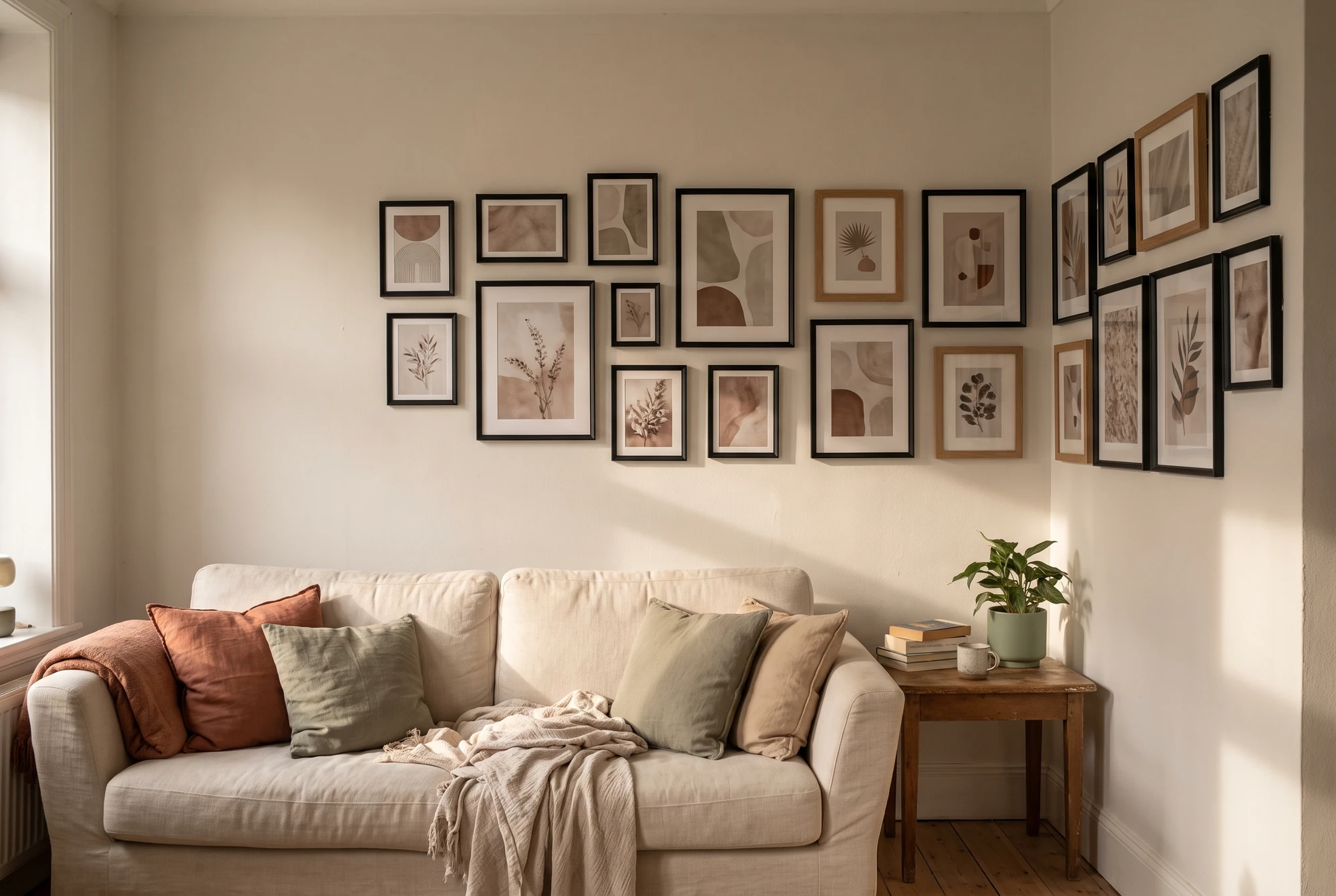
Most corner gallery wall ideas you’ll find are photographs of finished corners, which is a bit like being handed a picture of a cake instead of the recipe. The corner is the part that decides whether the whole thing looks deliberate or looks like you ran out of wall.
We went looking for actual guidance and found something worth knowing up front: the two most commonly repeated methods contradict each other. One says to anchor a medium piece right at the corner to bridge both walls. The other says to draw an invisible line an inch or two off the corner and align every frame edge to it. Both are given as the rule.
They can’t both be right for your corner, and which one you follow depends on something neither guide mentions — whether your two walls are the same length. Here’s how we’d actually plan one.
Quick Picks
- Best for renters who want to rearrange: picture ledge on the lead wall
- Best alignment tool: self-levelling cross-line laser
- Best for a narrow return wall: small-format frame set
- Skip it if: your corner isn’t square — see below
How We Chose These Picks
We haven’t tested these in a lab — and we won’t pretend we have. For every pick, we read hundreds of verified buyer reviews across retailer sites and forums, looked for the complaints that keep repeating, and dropped anything with a pattern of quality problems. Prices checked on 29 August 2026.
Why corner gallery walls go wrong
A gallery wall on a flat wall is one composition. A corner gallery wall is two compositions that have to agree with each other, and three things make that harder than it sounds.
The walls are almost never the same length. In most rooms — and nearly every apartment — one wall is the main event and the other is a short return of two or three feet. Treating them as equal halves of a symmetrical arrangement is the single most common way these fail. The result reads as an arrangement that got interrupted.
They’re almost never lit the same. One plane usually faces a window and the other faces away, so identical frames genuinely look different on each side. Glossy black frames show this worst; matte finishes and natural wood hide it.
Corners are the least square part of any room. Walls meet at something close to 90 degrees, not exactly 90, and older buildings drift further. This matters because your eye reads the corner itself as the straight reference line — so a frame hung level will look crooked if the corner leans, and a frame hung parallel to the corner will be crooked.
| Situation | Best approach | Why |
|---|---|---|
| Both walls similar width | Bridge the corner with one medium piece | Reads as one continuous arrangement |
| One long wall, one short return | Lead wall + supporting return | Honest about the asymmetry instead of fighting it |
| Corner visibly out of square | Align to a laser line, not the corner | The corner is lying to you |
| Textured or bumpy walls | Ledge or small nails, never adhesive | Adhesive can’t make flat contact |
The decision that makes it work: pick a lead wall
Before you hang anything, decide which of the two walls is in charge.
The lead wall is the one you see first when you walk in, or the one you face from the sofa. It gets the largest piece and the densest arrangement. The other wall — the return — carries fewer, smaller pieces that trail away from the corner.
This is the opposite of what most corner gallery wall ideas imply, and it’s why so many attempts look unbalanced. Symmetry across a corner only works when the two walls are genuinely comparable. The rest of the time, a deliberate lead-and-return reads as designed; a forced 50/50 reads as a mistake.
Once you’ve chosen, the designer “corner hang” method becomes easy to apply: build outward from the corner on the lead wall first, then let the return echo it at lower density.
Get the heights right before you touch a nail
Two numbers do most of the work here.
Centre height: 57–60 inches from the floor. That’s average standing eye level, and it’s the convention galleries use. Every source we read landed in that range. Crucially, this applies to the visual centre of the whole arrangement, not to each individual frame.
Gap: 2–3 inches between frames, and the same gap where the walls meet. Keeping the corner gap identical to the interior gaps is what makes an L-shaped arrangement read as one piece rather than two.
If the corner is a seating area you mostly look at from a sofa, drop the centre to around 52–54 inches. Standing eye level is the wrong reference for a wall you only ever see sitting down.
The tool that makes a corner possible
On a flat wall, a pencil, a tape measure and patience are enough. Around a corner they aren’t, because you need the same horizontal reference to continue across a fold in the surface — and a spirit level can’t carry a line around a corner.
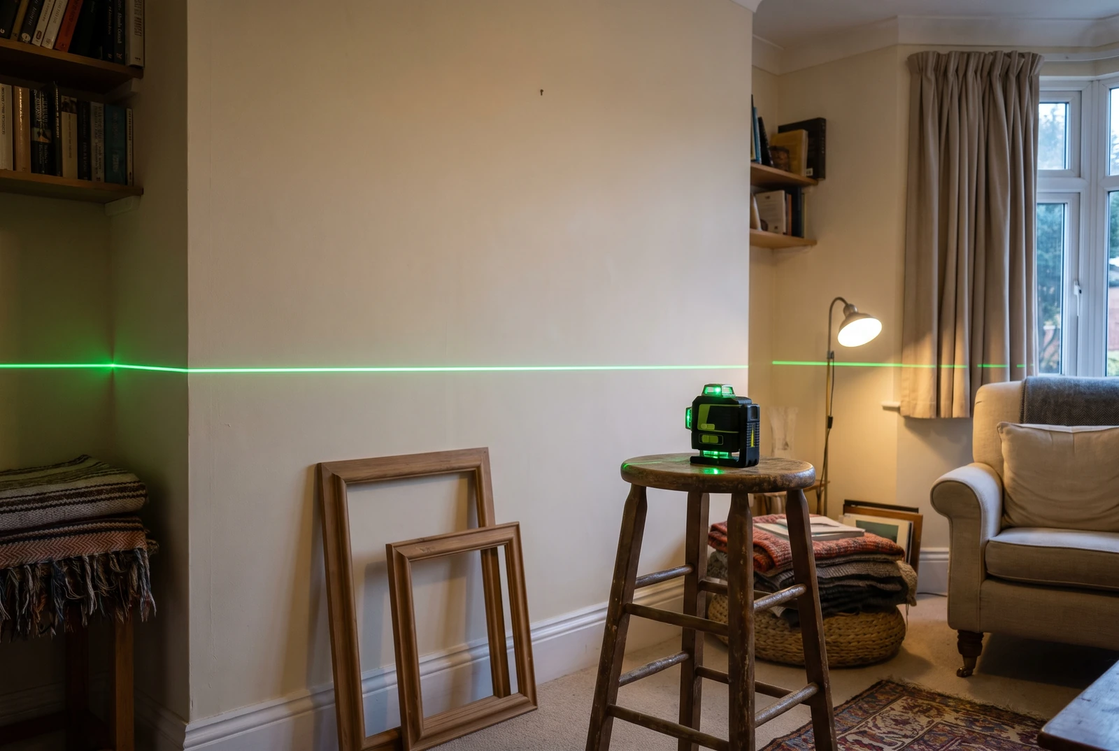
A self-levelling cross-line laser solves exactly this. It throws a horizontal line that wraps both planes at a true level, so you’re aligning to gravity rather than to a corner that may not be square.
Two things come up consistently in buyer reviews. Green beams are far easier to see indoors than red ones in a normally lit room — reviewers describe this as the difference between usable and not. And self-levelling is the feature that matters for this job; manual-levelling models put you back where you started. Budget models handle picture hanging perfectly well. This is not a job that needs a contractor-grade tool: 360-degree planes, a 200-foot range and a rechargeable battery are all built for job sites, and none of them make a picture straighter than a $60 cross-line will.
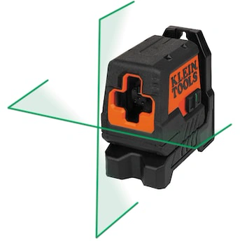
The one tool that makes a corner arrangement possible rather than merely difficult. Green beam and self-levelling are both worth insisting on; drop either and you’ll fight it.
Shop It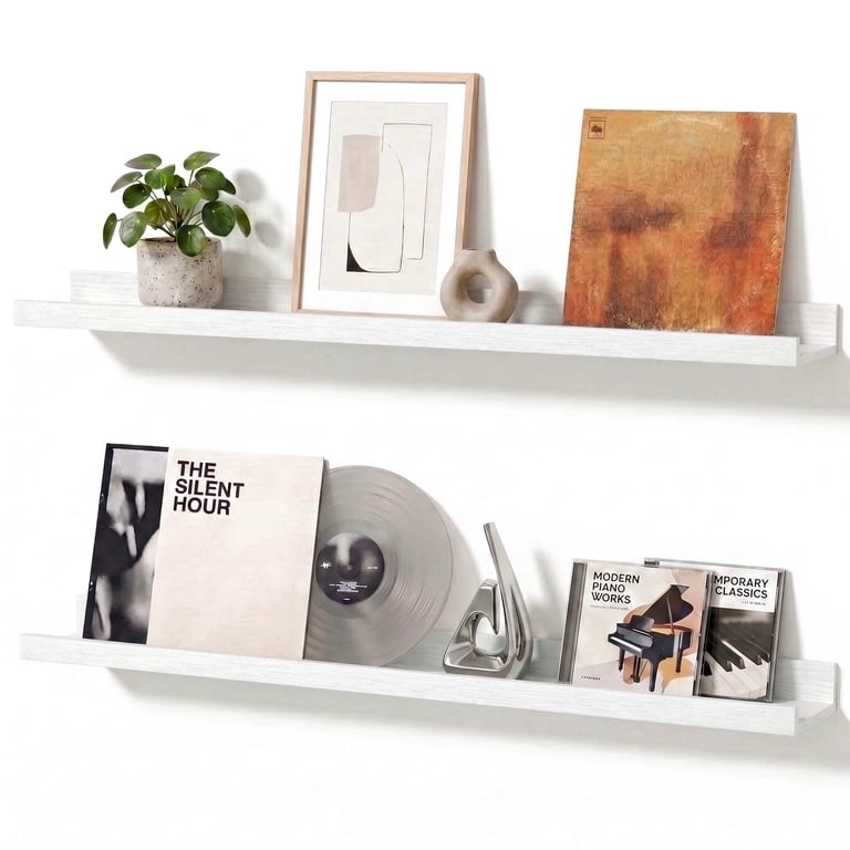
A pair is the corner answer: one on each wall at the same height, nothing committed, everything movable after you see it in place.
Shop ItA rule worth borrowing from designers who do this for a living: never leave more than a hand’s width between pieces. It is the same idea as the two-to-three inch gap, only easier to check while you are holding a frame than a tape measure is — and around a corner it is the gap that drifts most, because people unconsciously widen the spacing as they turn onto the second wall.
Corner gallery wall ideas: four layouts that work
The wrap. One medium piece sits closest to the corner on the lead wall, with the arrangement continuing onto the return at the same height. Best when both walls are reasonably wide. This is the layout that makes a corner look intentional rather than incidental.
The lead-and-trail. Dense cluster on the lead wall, then two or three smaller frames stepping down and away along the return. The most forgiving option, and the right one for a short return wall.
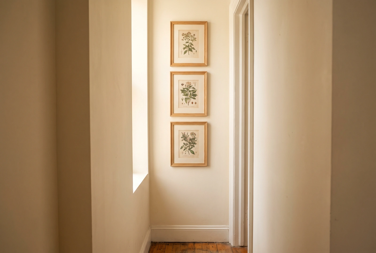
The vertical corner column. A narrow stack of three or four small frames running down the return wall an inch or two off the corner, with the main arrangement on the lead wall. Excellent in apartments where the return is barely a foot wide — a strip most people write off as dead space.
The ledge pair. Two ledges at the same height, one on each wall, meeting near the corner. Nothing is committed; everything can move. The most renter-friendly version by a distance.
Frames: where corners change the calculation
On a flat wall, a matched multipack is usually the efficient choice. Around a corner, two things shift.
Finish matters more than usual, because of the lighting difference between the planes. Matte black and natural wood hide it; high-gloss frames show it plainly.
The return wall often needs sizes multipacks don’t include. A 14-inch-wide return has no use for a 16×20. This is where small-format sets earn their place — not because they’re better, but because they fit.
If nothing off the shelf works, custom framers will cut to any dimension you give them. It costs several times what a multipack does, so it’s worth it for one or two frames that make an awkward gap work, and rarely worth it for a whole wall.
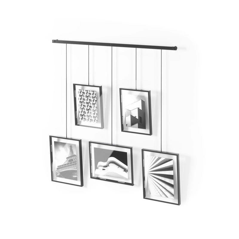
Mixed sizes in one finish — the efficient way to fill the lead wall without the arrangement looking like a catalogue page.
Shop It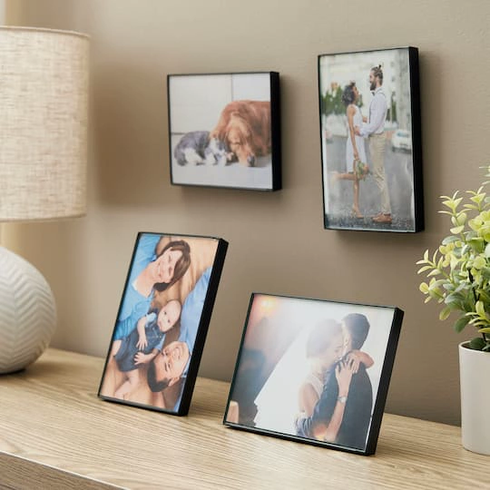
For the return wall and the vertical column. Matte black is the right call around a corner — it hides the lighting difference between the two planes that gloss shows up.
Shop It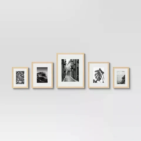
Natural wood, five mixed sizes, and the cheapest way to cover a lead wall. Sizes are fixed, so check them against your wall before you commit to the layout.
Shop ItTest the layout before you make holes
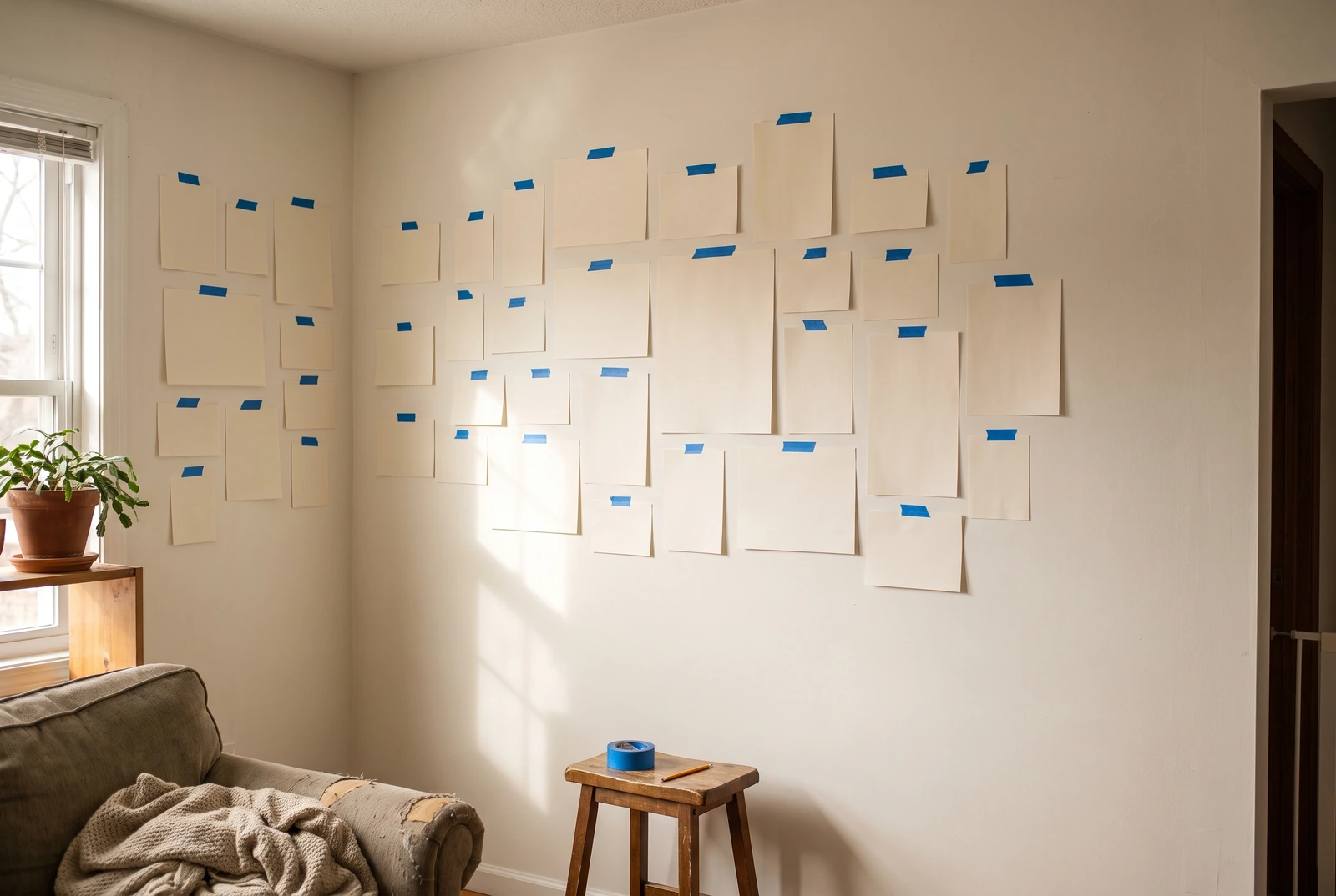
Cut paper rectangles the size of each frame and tape them up. It looks unserious and it is the step that saves you from a wall of misplaced holes.
Around a corner it matters more than usual, because the arrangement only exists from one viewing position — the point where you can see both walls at once. Stand there. A corner gallery wall that’s balanced on paper is often visibly lopsided from the sofa, and paper is how you find that out for free.
Leave the paper up for a day. The corner you love while holding the tape sometimes looks wrong the next morning.
If you’re renting, the choice of how to fix everything to the wall matters as much as where — ledges, small nails and adhesive strips each cost you something different in wall damage. Our renter-friendly gallery wall guide compares all three, including what 3M actually specifies about surfaces — and what it pointedly doesn’t.
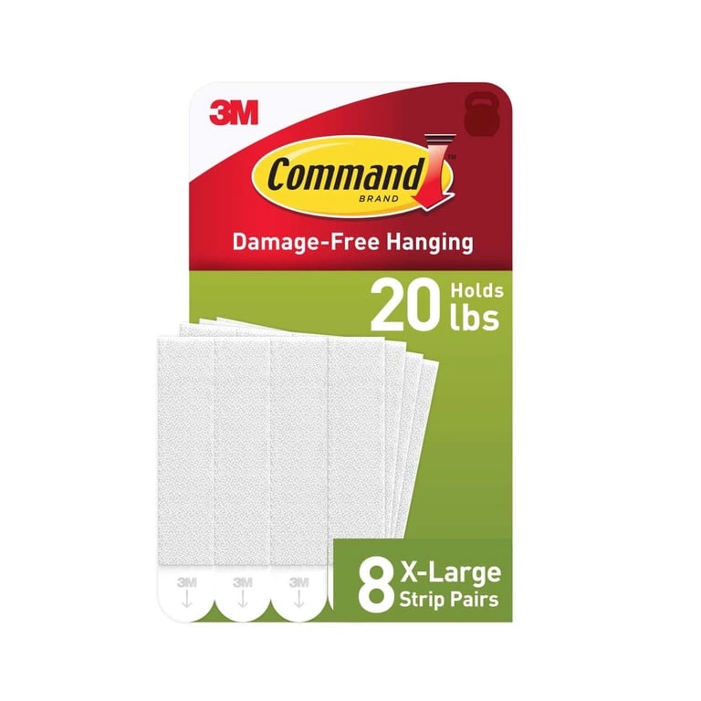
Rated to 20 lb a pair, so weight is rarely the limit — the surface is. 3M specifies mostly smooth surfaces, and corners are where walls are least flat.
Shop It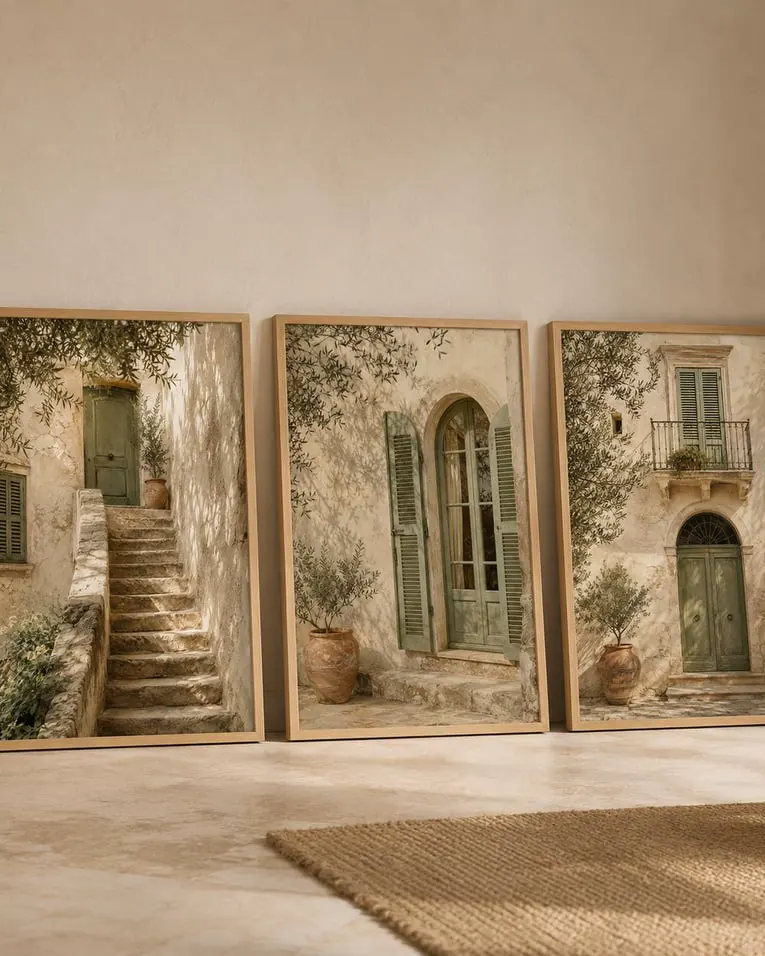
Downloadable prints let you size art to the wall rather than sizing the wall to the art — genuinely useful on an awkward return.
Shop ItSkip it if your corner isn’t square
Some corners shouldn’t get a gallery wall, and it’s worth knowing before you buy frames.
Hold a long spirit level or a laser line against both walls near the corner. If the gap between the line and the wall changes noticeably along its length, the corner is out of square or the wall bows. You can still hang art there — just don’t run an arrangement across the corner, because the mismatch gets more obvious the closer the frames sit to it.
The workaround is simple: treat the two walls as separate arrangements with a clear break, rather than one continuous L. Keep frames at least eight to ten inches back from the corner on both sides, and the eye stops using the corner as a reference line.
Corner gallery walls are also one of the better tricks available in a small space, because they use two planes of a room that usually go to waste. If you’re working with a rental or an apartment, the same logic applies to a cozy living room setup — the corners are where the space you already have is hiding.
Frequently Asked Questions
How far from the corner should the first frame go?
Between 2 and 3 inches, matching the gaps you’re using between frames. Consistency is what makes the two walls read as one arrangement.
Should the frames be the same on both walls?
The same finish, yes. The same sizes and density, usually not — the return wall almost always wants fewer and smaller pieces than the lead wall.
What height should a corner gallery wall be centred at?
57–60 inches from the floor for a standing view, or 52–54 if you’ll mainly see it seated. That’s the centre of the whole arrangement, not of each frame.
Can I do a corner gallery wall with adhesive strips only?
Only on smooth walls with light frames. 3M specifies mostly smooth surfaces and says no to brick and wallpaper, which rules out a lot of rentals.
What if one wall is much shorter than the other?
Lead-and-trail, or a vertical column on the short wall. Don’t try to make a short return match a long wall — that asymmetry is what makes corner arrangements look unfinished.
The criticism designers make most often about gallery walls is that there are too few pieces in them. On a flat wall that reads as sparse; around a corner it reads as an arrangement that gave up halfway — the exact impression a corner wall is supposed to prevent. If you are torn between two counts, the denser one is almost always the one you end up happier with.
The short version
Pick a lead wall. Match the corner gap to your frame gaps. Centre the whole thing at 57–60 inches, or lower if you’ll see it sitting down. Use a laser line rather than trusting the corner, and test it in paper before you make a single hole.
The best corner gallery wall ideas aren’t really about which frames you buy. They’re about admitting that your two walls are different, and arranging them accordingly.